Making information easy to read, and pretty too
As the amount of data fueling the information age grows exponentially, we need new ways of making sense of all that information. Data visualisation is an art form for the twenty-first century; it takes all the results of all our science and politics and everything else, and it reorganises them visually so that relationships are clear and interpretations possible. So much more is possible than the pie charts and bar graphs of yesteryear.
David McCandless is a master of data visualisation. In this TED talk he shows us some of his work.
Fully booked
— next courses available in January
(request early to avoid disappointment)
More courses and solutions available on request: contact me for more info
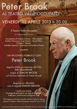
Peter Brook is one the great theatre directors of the twentieth century. His 1970 production of A Midsummer Night's Dream made theatre history.
On Friday April 12 at 8pm the Teatro Valle Occupato is screening 'The Tightrope', a documentary about Brook by his son, Simon Brook. The film will be followed by a public debate with Peter Brook.
You can book tickets by sending an email to peterbrook.tvo@gmail.com
Did you enjoy this article?
Then visit get some more English
The Future in the Past
Susan Cain: The power of introverts
Wish and wishes
Mavericks – what’s in a name
Make or do
On -ing forms in titles
Comments please
Narrative Tenses
Mavericks – what’s in a name
New this year: Evernote-Moleskine notebooks in my private lessons
irregular verbs:
basic | intermediate | dictionary
phonetic symbols:
basic | extended | notes | SAMPA
Follow me around the web on
![]() Amazon
Amazon
![]() Facebook
Facebook
![]() Flickr
Flickr
![]() Paper.li
Paper.li
![]() Pinboard
Pinboard
![]() Posterous
Posterous
![]() SlideShare
SlideShare
![]() Twitter
Twitter
![]() YouTube
YouTube
 www.davidnicholson.it by
David Nicholson is licensed under a
Creative Commons Attribution-ShareAlike 3.0 Unported License.
www.davidnicholson.it by
David Nicholson is licensed under a
Creative Commons Attribution-ShareAlike 3.0 Unported License.
Permissions beyond the scope of this license may be available at
permissions@davidnicholson.it.